
Charts
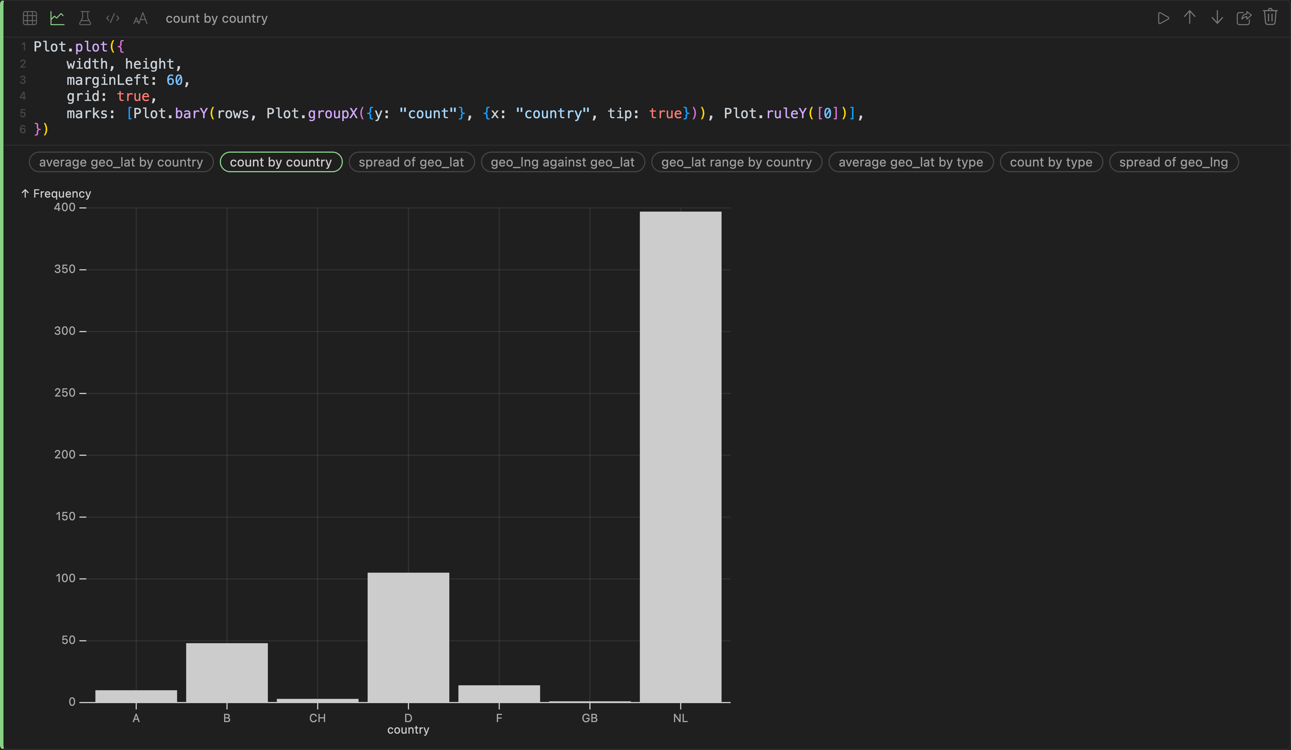
A chart cell writes its own first draft. The column statistics say which column is a date, which is a category, which is a measure and which is an id that counts up once per row — and the strip under the code offers the charts those columns actually support, named in plain words.
Click one and its source is written into the editor and drawn. After that it is source, and it is yours:
js
Plot.plot({
	width, height,
	marginLeft: 60,
	grid: true,
	marks: [Plot.barY(rows, {x: "country", y: "count", tip: true})]
})
rows is what the cell above produced. The plotting library is Observable Plot, so anything its API can draw, a cell can draw.
Suggestions are named after your columns, not after chart types — count by country, average geo_lat by type, spread of geo_lng — because the question is what you have, not which mark implements it.
Next: models.